
Project Vision
The goal of this project is to develop a smooth, integrated platform that makes parking in cities easier. The objective is to lessen everyday annoyances, save time, and increase public confidence in city parking authority by allowing users to easily pay fines, appeal unfair citations, and locate available parking within a single app.
In addition to promoting smarter city mobility and easing the burden of parking management, our solution seeks to empower users with clarity, control, and convenience.
Challenges
-
Make sure parking availability information is accurate for users who are constantly on the go.
-
Simplify the ticket dispute procedure to cut down on paperwork and confusion.
-
Create a user-friendly interface that is suitable for both tech-savvy and novice users.
-
Secure sensitive user data during payments and disputes to foster confidence.
Kick - Off
In this project my goal was to solve the everyday annoyances that drivers have when parking in cities. Determining the issue space, examining current parking and payment options, and performing competitive analysis to find gaps were all part of my start process. In order to identify issues with paying, disputing tickets, and finding parking, I also conducted exploratory user interviews. I used these data to inform my design approach by mapping user journeys and developing preliminary personas.
How long does it take for 6-8 people to find/reserve the parking?
Which payment options does users prefer and why?
How many steps does it take users on average to complete a parking reservation, and how long does it take?
What can we learn from the steps users take to find/dispute/pay ticket on the same app, versus using a third party website or an app.
What challenges and frustrations did user find while going through the app?
Affinity Diagram

Meet the Users


Competitive Analysis
Through my competitive analysis I found that - PayByPhone and ParkMobile prioritize parking payments, however they don't have smooth dispute resolution integration. Although it feels antiquated and cumbersome, Green P offers certified city-backed services. Although it doesn't manage payments or disputes, Google Maps is excellent at navigating and rule awareness. In general, the majority of solutions address either navigation or payment, but none integrate ticket discovery, payment, and dispute in a seamless process.
There were a few majority of the features between the competitors. However the main differences were:
-
Parking payments were the primary focus
-
Poor or insufficient dispute resolution.
-
The majority of apps provide simple alerts or reminders.
-
Accessibility frequently needs to be improved (small text, sophisticated user interface).
Preparing the Journey
I made a user flow that charts every step of using the app, from finding parking to paying or disputing tickets, in order to better understand how users will engage with it. This makes it easier to picture the entire experience and spot areas where friction can be decreased.

Starting the Design Process

Paper Wireframe
I began by organizing the main functions of the app and rapidly experimenting with layout alternatives using paper wireframes. I was able to picture how users would handle parking, payment, and ticket dispute at this step. Prior to using digital wireframes, it also assisted in improving the structure.

Digital Wireframe
I then created digital wireframes to improve the layout and add more structure after sketching ideas on paper. Before advancing to prototypes, these wireframes made sure the design remained clear and user-friendly while streamlining navigation for essential functions like parking, paying, and contesting tickets.
Iteration Process
In order to better meet user expectations, I conducted a usability research on the low-fidelity prototype and found several important areas that required improvement. The comments emphasized the need for less human labour, quicker payments, and more transparent confirmations. I improved the design by streamlining dispute procedures, enhancing visitor login flexibility, and fine-tuning payment alternatives. These modifications made the experience more seamless and intuitive.


Integration of Multiple Payment Options
According on usability comments, users preferred flexible payment options. To make purchases quicker and easier, I integrated Samsung Pay, Apple Pay, and Google Pay.
Confirmation Screen
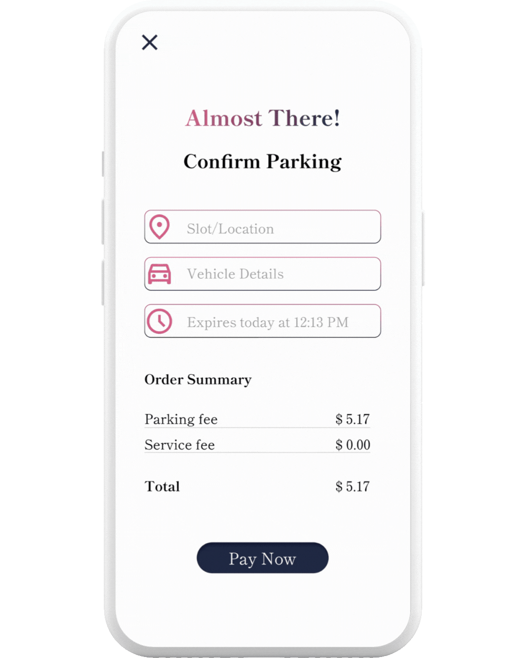
Users were hesitant to proceed straight to submission/payment. In order to decrease errors and foster confidence, I added a confirmation screen prior to the checkout page for users to review ticket and parking information.

Ticket Scanning Option
It was thought to take a lot of time to type ticket numbers. To reduce manual entry, I included a feature that allows users to scan or snap a picture of the ticket or license plate for both dispute and payment processes.

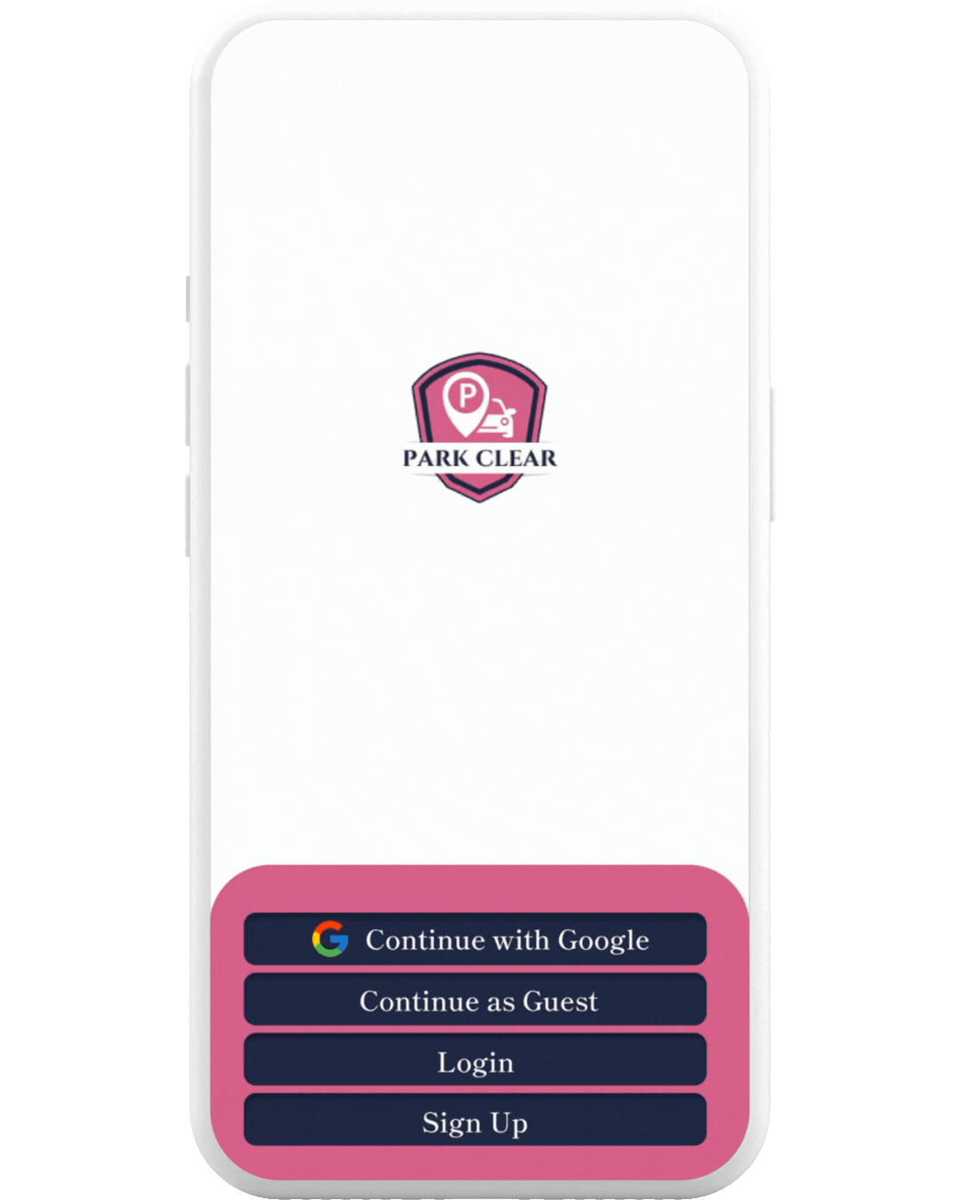
Guest Login for Quick Access
Users didn't want to waste time setting up accounts when running errands or dropping off children at school. I included a guest login feature so they could finish jobs fast without registering.

Refined Navigation Consistency
I changed the button locations and navigation flow in response to feedback in order to maintain consistency in the steps taken for each activity (pay, dispute, and reserve), making it easier to use and less confusing.
Challenge 1
Eliminating Barriers
The requirement to create an account was one of the primary issues found during usability testing. Users complained about having to wait to sign up before using essential capabilities, particularly when running errands or dropping off children at school. I added a guest login option to remove this obstacle. This made it possible for customers to quickly complete necessary operations like paying or contesting tickets. In addition to increasing productivity, the change made time-sensitive scenarios more inclusive and user-friendly.
Users who log in as guests will only be able to make bookings or access rapid parking. For security and verification reasons, features like disputing or paying tickets are only available to registered accounts.
Challenge 2
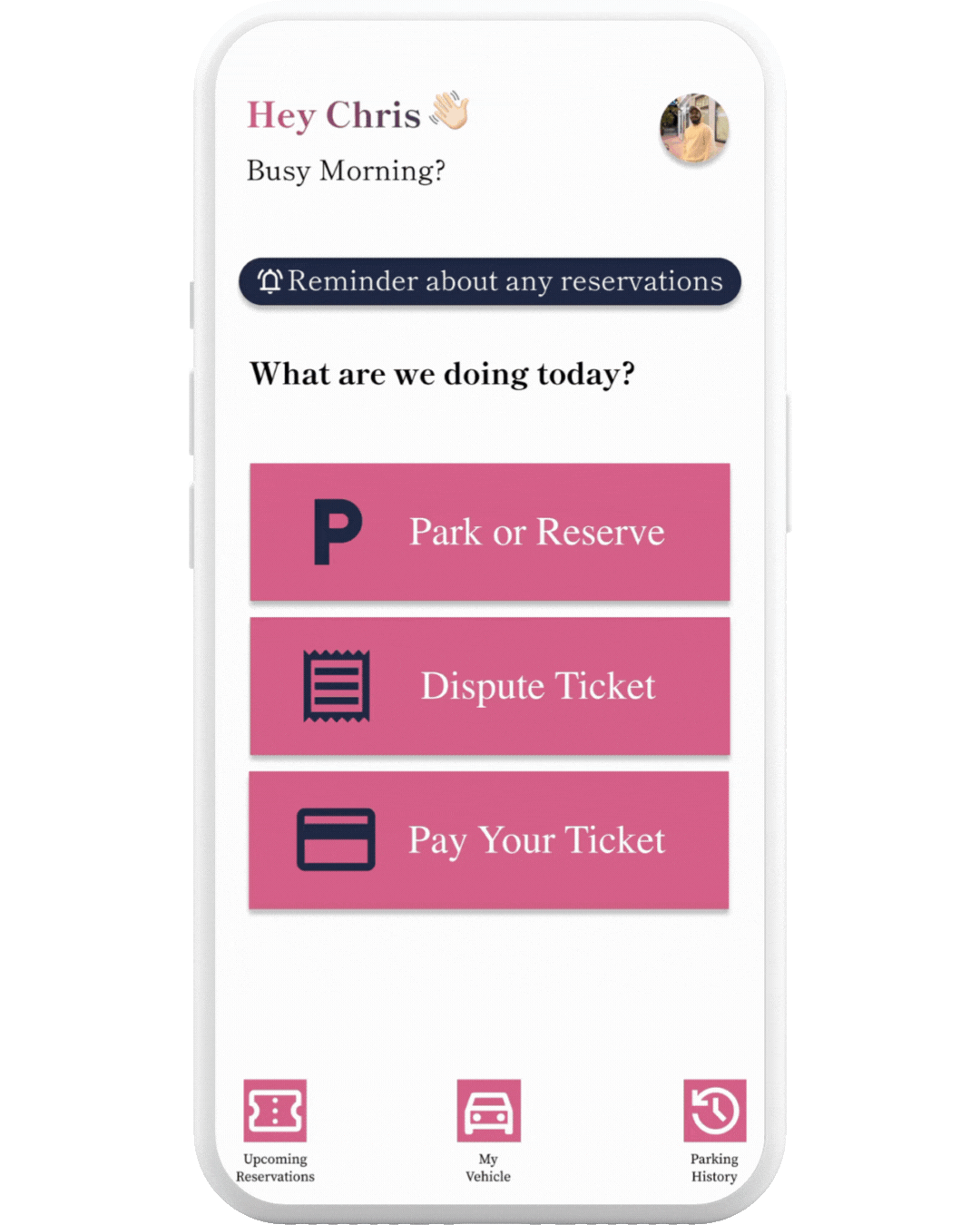
Staying Focused
The second challenge was making sure the home page was straightforward and easy to use without overwhelming consumers was another difficulty. I kept the interface simple and focused by sticking to just two colours in the design to accomplish this. In order to distinguish each action button as a primary touchpoint, a faint inner shadow and a darker tint were used. By directing users' attention and making it obvious where to tap, this visual hierarchy decreased confusion and accelerated task completion. As a result, the home screen became more simple yet still useful, facilitating speedy decision-making.
Challenge 3
Seamless Checkout
Users voiced their desire for more convenient and adaptable payment options throughout testing. In order to solve this, in addition to the traditional card payment option, I added many digital wallets, such as Google Pay, Apple Pay, and Samsung Pay. In order to speed up the procedure and minimize repetitive entry, I have added the option to safely save card information for later use. These improvements gave consumers more options, more productivity, and a smooth checkout process that complemented their regular payment preferences.
Style Guide


Key Takeaways
I learned how crucial it is to balance speed, clarity, and adaptability in user experiences while working on this parking software. I discovered through usability research that minor design choices, such as extending payment options or incorporating guest login, can greatly lower user friction in practical situations. I was able to observe how confirmation screens and streamlined navigation enhance usability and trust by iterating on the low-fidelity prototypes. Most significantly, I came to understand that when it comes to financial transactions and time-sensitive jobs, it is essential to design for both convenience and security. I now have a greater understanding of how well-considered interaction design can turn common problems into elegant fixes thanks to this project.